
Traditionally measuring customer satisfaction involves asking customers to fill out surveys. But customer satisfaction data is being captured organically in the form of reviews and in conversations on social media. The Symanto Insights Platform automates customer satisfaction data analysis from readily available content online.
In this article, we’ll show you how to interpret the results from the Symanto Insights Platform to draw meaningful and actionable insights into customer satisfaction.
As you will discover, the Symanto Insights Platform not only gives you an overview of customer sentiment towards your brand with intuitive visualisations , but it also enables you to dive down to a granular level and explore in-depth what topics people are talking about, how they feel about your brand, and even their personality traits and communication style preferences.
Exploring Topics and Sentiment
Once the Symanto Insights Platform has completed its analysis, click on the explore tab to the left of the screen. You’ll notice that there are five tabs along the top” Overview, Sentiment, Classification, Psychographics, and Recommendation.
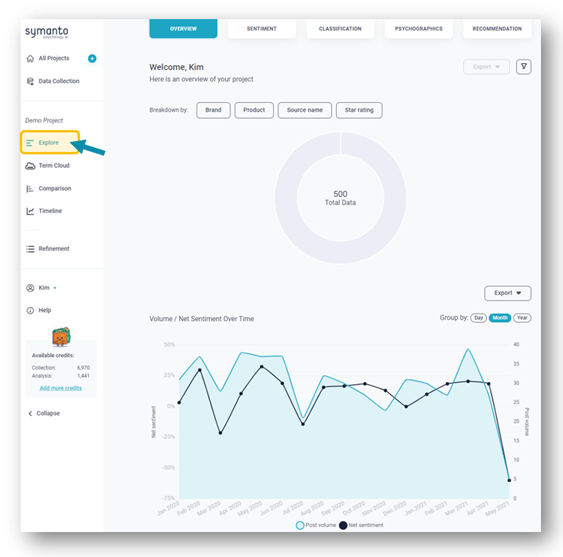
1. Overview
The overview will give you a broad first impression of your analysis such as total amount of data and net sentiment over time.
Click on the buttons above the donut chart to breakdown the data by the various metafields in your input file e.g, brand, source, product etc.
If you’ve uploaded data about your competitors, this is a useful starting point to discover your brand’s share of the conversation.
You can then further subdivide this data by clicking “add split” and selecting another category.

You have the option to download the donut and net sentiment charts as a CSV of PNG file.
2. Sentiment
Once you’ve taken in the overview, it’s time to dive deeper and explore sentiment by clicking on the second tab along the top of the screen. When it comes to customer satisfaction data analysis, the comprehensive breakdown of customer sentiment in both this tab and the classification tab are probably the most useful and valuable feature of the Symanto Insights Platform.

Here you can see how your brand fares against its competitors in terms of brand sentiment. Click on each brand to reveal a word cloud showing which words are most mentioned and their associated sentiment.
When analysing customer satisfaction, it’s particularly important to be accurate when assigning sentiment. The Symanto Insight Platform’s AI technology can differentiate between positive and negative sentiment based on how the words are used in context.
Take, for example, the word “ages”. This word can have a positive or negative sentiment dependant on which topic it relates to. When discussing battery life, it has a positive sentiment: “the battery lasts ages”. When talking about loading times, it has a decidedly negative sentiment: “It takes ages to start up”.
Apply a slicing filter to break down sentiment buy category, topic, personality type and whether the author is likely to recommend your brand, or enter a date range.
3. Classification
This section enables you to explore sentiment by topic. Find out which topics have the most positive and most negative sentiment associated with them to easily identify the strengths and weaknesses of your brand.
Each topic is given a net sentiment score which is calculated by deducting the number of negative mentions from the number of positive mentions and displayed as a percentage.
Click on the headers to sort by the different columns. Apply filters for either topic or category.

Selecting a topic will bring up a new layer to the right of the screen allowing you to explore the topic in more depth.
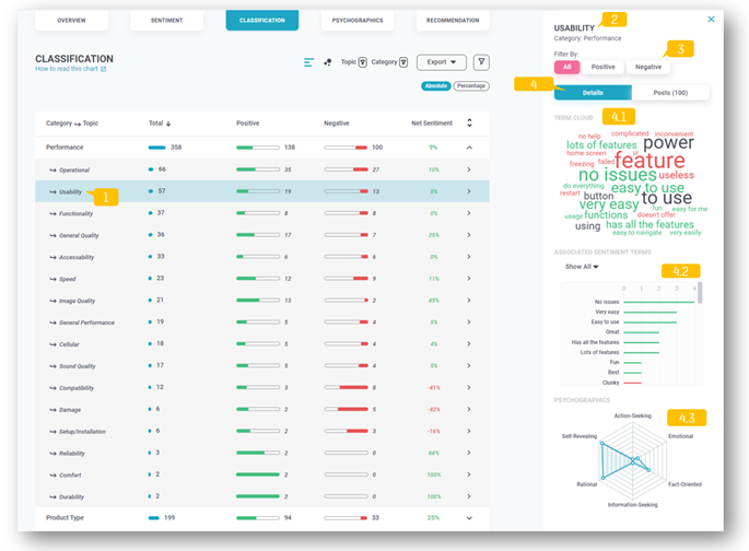
You can filter by Sentiment: All, Positive or Negative. Each topic has its own word cloud for you to see what words are most mentioned regarding the topic. A bar chart shows the level of sentiment of each of the terms detected with the selected topic. You can also see what personality types are most talking about the selected topic.
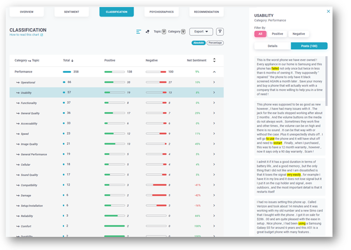
Click on the “Posts” tab towards the top of the layer to read original postings that mention your selected topic.
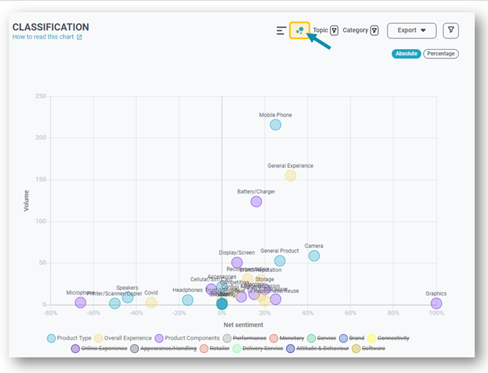
Bubble chart visualisation
Click on the bubble icon towards the top-centre of the screen to get a different visualisation of the data.
The bubble chart view makes it easy to identify critical topics in an instant. Topics with most mentions float to the top of the chart, those with lowest net sentiment appear to the left of the screen, those with the highest, to the right. If a topic appears to the left and towards the top, this shows that customers feel negatively about the topic, and it will need addressing.
4. Psychographics
The psychographics tab enables you to identify the personality traits and communication styles of your brand’s customers.
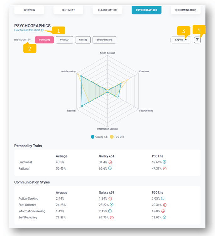
Breakdown the psychographics into your different metafields, e.g. brand, product, ratings or source.
In terms ot customer satisfaction data analysis, this allows you to better understand the kind of connection your customers have with your brand. Are they emotional or more rational? Do they want information or are they action-seeking? This information can inform how best to interact with your customers to keep them satisfied.
5. Recommendation
The final tab relates to whether each post promotes, detracts or is indifferent to your brand. It’s a marker of whether the post is intended to influence others.

Ideally you want promoters who are emotionally connected to your brand. These customers are over twice as valuable to your brand as highly satisfied customers without an emotional connection.
As with the classification tab, when you select a row, a new layer appears showing a word cloud and a bar chart with the top mentioned topics listed.
For more information about the Symanto Insights Platform, get in touch or book a free personalised consultation.
